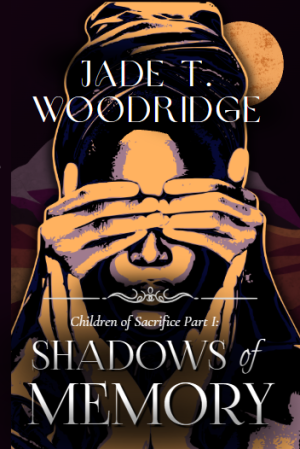
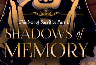
I really like the second cover better, because I like the sand border between the title section and the cover image. I would however, move the title a smidge, maybe 5 points to the right away from the spine. Because 'Children of Sacrifice' isn't directly above. It looks a bit misaligned, not quite right. I like the color scheme a lot and think gold/purple looks great. I would say however, that the font is a little too BOLD for the title. I think maybe if you bring down the opacity and blend it more with the background color, it might feel more natural. I would also advise putting the blurb on the back when working on the cover so you can get a feel for the words. Because I know sometimes I begin to typeset and the font is not right. Haha. Anyway, the cover looks pretty and you should be proud for being at this stage of writing. It's truly awesome.
)
)


