Feedback On Cover Design

JT Woody

Head Book Witch
Active Member
Member
New Member
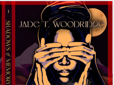
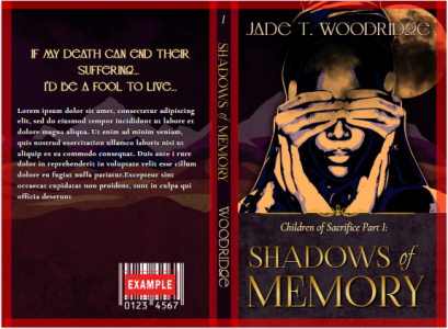
the copyeditor will be finished up with my manuscript this week, so I wanted to revisit my cover and tick that off my checklist. There are a few elements I'm iffy on, so I'm looking for feedback (EDIT TO ADD: the red borders are guides and will not be on the final) :
1768760942779.png
1768760981888.png

Note: measurements will change slightly once I format the text.
"Lorem ipsom" is a place holder. I'm still trying to tweak my back cover blurb and cut it down to size 😅 . May ask for feedback on that later.


(cover designed on canva. images and illustrations created/manipulated by me. font and additional elements from canva. No AI)
 
Last edited:

Cool. Because if it was part of the design, I would have said I hated it. :)

The only thing I noticed is, shouldn't the spine have the same for your name as the cover? Other than that, it works for me - it's quite classic, and I think that's much better than some of the crappy AI covers I've seen posted in various places.
 
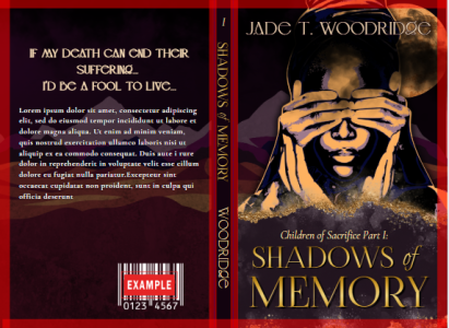
I like the bottom one, where the line isn't straight and looks a little like sand.

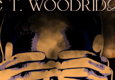
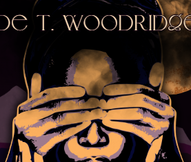
One thing I noticed was that the hood seems to go far above the head, either indicating a tall hairstyle or a tall forehead, which looks odd to me.

Other than that, it looks nice.
 
I'm sorry but I'm not seeing the difference in the two images, one seem zoomed in. And I can't click on them to see more.

To clarify, I mean the height of the hood top seems to extend far above a normal human head, unless it's intended.
Ah, i thought you meant the exposure of her forehead made her head seem too tall. I colored in the lighter color of her forehead to reduce the amount of exposed surface space.
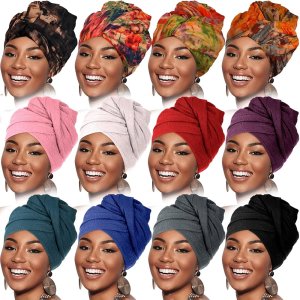
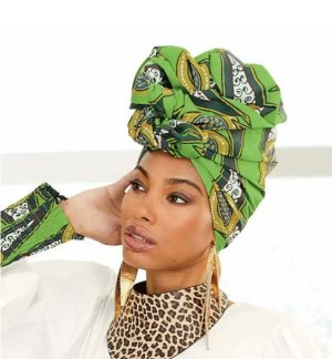
As for her "hood".... its a type of african headwrap that is fuller/taller on top.
1768772148837.jpeg1768772179708.jpeg

I could get rid of the shadow behind the text to show the start of the scarf? But im not quite sure how to make the text stand out against the texture
 
The title font/color
And the background that the title sits on

I think those are fine.

Maybe on the headwrap, increase the highlights (I think) a little so that some of the detail of the headwrap starts to appear, but in dark yellows and browns, so the text still stands out?
 
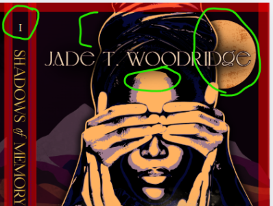
Only a couple of thoughts. The I on the spine would look better if it weren't italicized. The G for the author name font is strange, doesn't look like a G. Finally, the brightness of the moon in the top left that's behind your name affects the legibility. Maybe you could flip the moon around so it's darker on the top rather than the bottom.
 
I love the arrangement of hands and lower face, especially the version with the blurred line above the title. It's perfectly beautiful, in fact. The top third confused me a bit. I finally decided I was looking at the moon in the upper right, but even after you provided head wrap examples. I'm not seeing anything but undefined darkness above the hands. Might be a function of looking at the example on a lap top.
 
This looks good. Unique. Still stands out at thumb-size. I might guess it's historical fiction from the cover.

The moon is hyuge. Is this set on Earth? If so, I'd try shrinking it to normal to see how it looks. It also seems to throw the whole composition a bit out of whack at this size.

I'm not graphic-educated though, YMMV.
 
Ah, i thought you meant the exposure of her forehead made her head seem too tall. I colored in the lighter color of her forehead to reduce the amount of exposed surface space.
As for her "hood".... its a type of african headwrap that is fuller/taller on top.
View attachment 820View attachment 821

I could get rid of the shadow behind the text to show the start of the scarf? But im not quite sure how to make the text stand out against the texture
Ah, so it's a headwrap! I really thought it was a hood and that's why it looked odd to me. Yeah, maybe do as Naomasa said, play around a little with highlights/outlines or the edges of the wrap to make it appear better.

Might be tricky to get it right, so that the headwrap doesn't interfere with the visuals of the name.
 
Thanks All for the feedback!
1768840760580.png

1768840384184.png

Maybe on the headwrap, increase the highlights (I think) a little so that some of the detail of the headwrap starts to appear
I'm not seeing anything but undefined darkness above the hands.
I removed the shadow/smokey effect that was obscuring much of the detail at the top

The I on the spine would look better if it weren't italicized.
de-italicized!
The G for the author name font is strange, doesn't look like a G.
unfortunatly, that is how the font is. I thought, maybe I took it off of caps, but even the lowercase "g" still looks like that. I might have to play around with other fonts, but as of now, I really really like this one 🥺

The moon is hyuge. Is this set on Earth? If so, I'd try shrinking it to normal to see how it looks. It also seems to throw the whole composition a bit out of whack at this size.
Not on Earth 😅
But I shrank the moon to see how it would look. I kinda like it! Makes the outline of the scarf standout better.


(Also decreased the amount of forehead exposure)
 
Next question:
This edge or that edge
1768841887340.png
1768841985218.png

(Catriona and Madman were the only ones who noticed 😅 )
 
Last edited:
Back
Top